RETECHNOLOGY PREMIUM MARKETPLACE RELATED PRODUCTS | WEBINARS | SPECIAL OFFERS


You are viewing our site as an Agent, Switch Your View:
Agent | Broker Reset Filters to Default Back to ListReal Estate Brand Ecosystem: Logos that Leave a Lasting Impression
March 08 2022
 Why is a real estate logo still important? Well, aside from representing your company's brand, today, real estate logos have more visibility than ever. In the past, logos might've appeared on your business card and maybe on some additional promotional material, but nothing more. Today, however, real estate websites, social media accounts, official email and other communication matters can not be imagined without the company logo. It gives your company credibility as well as ensures officiality.
What Is a Logo in Terms of Success?
What is a real estate logo if not the face of the company? Just thinking of Google, what is the first picture that pops up in your mind? Most probably, the colorful Google logo. It is the same for major companies around the world: Apple, Coca-Cola, Nike and many more.
What many guides on creating a real estate logo fail to mention is that a logo doesn't guarantee an instant success. Let's take, for example, Nike. It is one of the most famous logos, instantly recognizable. It stands out, creating a certain perception of the brand. But it wasn't always like that.
When the Nike Logo was created at first by a young designer, Carolyn Davidson, the company founders didn't find it appealing. But the products that Nike was creating and putting this logo on were of a great quality, and the marketing efforts of the company were successful, so after some time the company became widely recognizable. Therefore, the Nike logo became a symbol of success.
So, what can we take away from the Nike example? Your real estate logo will have success only if the services you offer, as well as the effort you put into your brand, are superb.
The Psychology of Symbols
The Nike example is just one of many successful logos, and often the success and the good service of the company backs up the logo and makes it recognizable. If we can apply the chicken or the egg question to our case, is it the company that draws attention to the logo or the reverse? In many cases, the answer is simple. The efforts of the company and the quality services they provide make the logo recognizable and fill it with meaning.
Only after that do logos become symbols more than just random lettering or shapes.
The Principle of Any Good Logo
Let's be honest. There is no recipe that guarantees the success of your logo design. But there are some principles that are tested by time. But first, let's discuss what kind of logos are out there.
Logomark
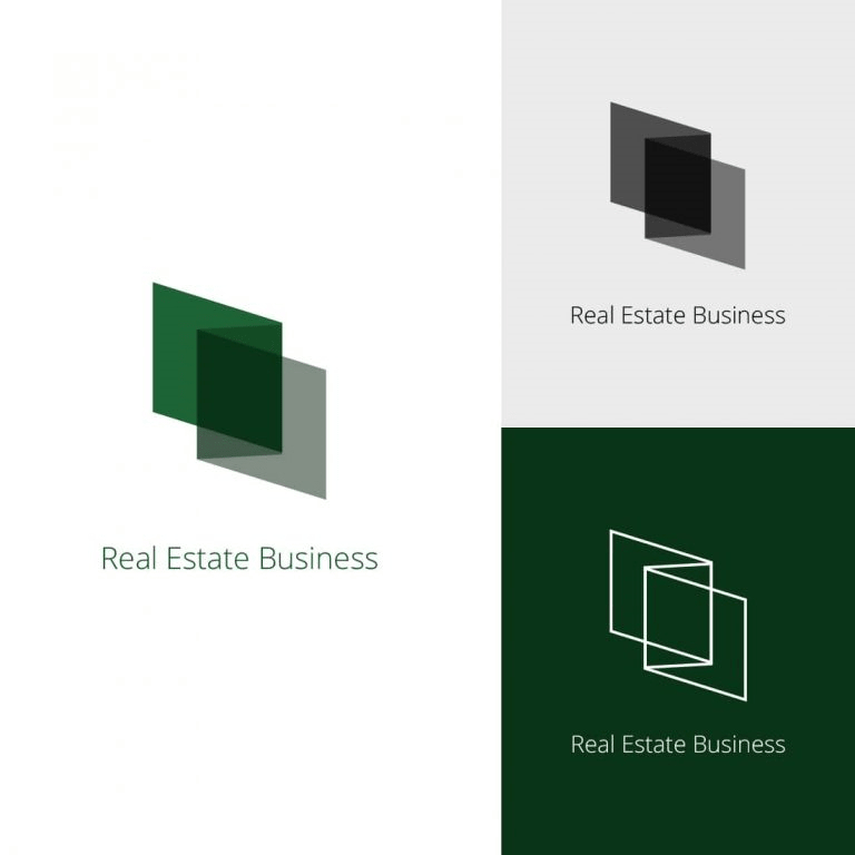
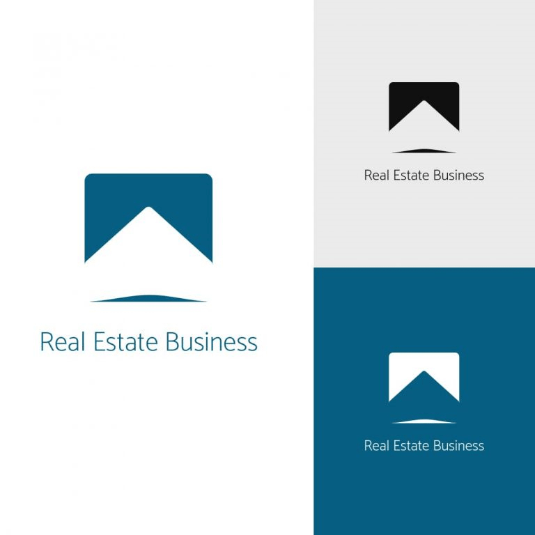
Logomarks are one of the most often used types of logos. Usually, they consist of abstract or geometric shapes. Take Apple, for example. It has rich symbolism behind its logo. An apple represents knowledge, but also a spark of innovation. The falling fruit was what led Isaac Newton to discover the gravity concept.
The real estate industry is full of logomarks. The abstract shape of a building is one of the most popular types of logos still to this day.
Logotype
A logotype focuses more on the company name. It involves more text than pictures. Perfect examples of the logotype are CocaCola, Google and Facebook.
If you want people to pay attention to the name of your company, logotype is a perfect choice.
Combination of Both
As the title suggests, there are logos that favor both text and geometric shapes—Pepsi, for example.
Logo Systems
The logo system is somewhat of a new concept. To understand the difference between the logo system and traditional logos, think static and dynamic.
When you think of traditional logos, you think of static images that are consistent.
Logo systems, on the other hand, can shift and change, adapting to different needs. Google doodles is one of the most famous logo systems.
Creating a logo system is expensive and time-consuming. So as experts suggest, this type of logo should be reserved for big companies.
Logo Design Trends
So, now that you're aware of the different types of logos, let's talk about what you should be looking for in logo design:
- Minimalistic geometric design
- Symmetry
- Perspective drawing
- Letters that stand out
- Analogous color scheme
Once you decide to create a logo, you can talk with graphic designers and discuss those trends.
Once you get your logo designed, you want to place it everywhere and let it work to make a brand impression in your desired audience.
To view the original article, visit the Realtyna blog.